
Friday, April 29, 2011
VC: 20
VC: 19

Friday, April 1, 2011
Journal Entry 13: Inventions

Football, more specifically Packers. Need I say more? Fine, I will. I really enjoy football and I know plenty of others who do as well. It's a great past time and a great invention.

When I'm dying of heat stroke, a fan really comforts me. In fact, I cannot go to sleep without one, I've tried!

Who doesn't know why the fridge is great? It keeps your food fresh and cools all your beverages. It's one of the greats!

If you've ever been really cold, you've probably loved to come home to one of these(or any heater). This is a great invention because you can take the heat anywhere with an outlet.

Long boards, God's gift to me. I really enjoy them. They're really cool and fun to ride. Gets me around quickly and is functionally.

Pizza, come on it's pizza! Who doesn't (sincerely) like pizza? It's one of the greats! Just look at what people order every party they have!

Can anyone imagine NOT having a cell phone anymore? Probably some...but besides that, cell phones are really useful. With many features these days besides calling and texting. They have become smart computers now. We're that much closer to Skynet.

Since Harrison Ford, we've seen lots of vehicles and we all know how much we depend on them. They're becoming very advanced these days and we'll be using them into the future.

I don't play as much anymore, but I do enjoy my xbox when the times come. Video games are a great invention and a great way to have fun with friends.

This isn't about the picture, it's about what took the picture! The Camera! I really enjoy taking photos, and I know many others certainly do as well. Can anyone imagine life without a snapshot? Or millions of snapshots?
Thursday, March 24, 2011
Journal Entry 12: Advertisements and Jefkins

Alright, for starters, I am aware this is not a real advertisement, but for the sake of this post, we'll pretend it is because it works...and it's awesome. This ad, though fake, is just pure funny. It appeals to movie junkies, comic book nerds, avid customers, and appeals to (what I consider) most people's sense of humor. For those who don't know it is mimicking the advertisement below, from 'The Dark Knight', one of the most highly grossed films. The immense popularity of that film certainly adds appeal to the McDonalds ad. People just enjoy this type of humor and if McDonalds was actually that legit, I'd spend more money there (but it's not). It does however inspire you to watch the movie!

Journal Entry 11: Myth

Thursday, February 24, 2011
Journal Entry 10: Advertisements and Color

Oztam is a TV ratings company based out of Australia. This advertisement is rich in color! All the colors flow together and make for an eye catching image overall. The blue (gradient) background allows the foreground to burst out of the page in a way. The colors white, yellow and red are far enough away from the color blue to give you the complimentary impression (certainly with red). The colors don't just help this particular advertisement, I'd argue that they make the advertisement! The colors are well contrasted and just as they are made bold in color, they make for an equally bold statement. The advertisement demands attention and it is well merited! There is harmony flowing through all portions of the page. It is extremely simple yet effective.
Journal Entry 9: Logos and Color Meaning
I chose three Logos everyone will be familiar with: ABC, Firefox and NBC.

Though this logo isn't as flashy as it's moder counterpart, it is in essence the same logo it has always been, without the shine. The two-color pallet offers a monochromatic logo. As such the logo(along with it's shape) becomes almost 'friendly' in a way. It's both easy on the eyes and easy to remember. Hard to not be harmonious with the two most basic of colors, black and white. Because of this, it is also complimentary.

We should all be familiar with Firefox by now, and their logo certainly would help you remember. First and foremost you'll notice the beautiful colorization. The (2) colors are complimentary and make for an eye popping image. The blue causes the orange of the fox to "jump out" of it's 2d space in a way. They chose these colors because they work well together, they are at the same time, strong and effective. I can guarantee with confidence (as could the logo's producers) that you will not forget this logo.

Thursday, February 17, 2011
Journal Entry 7 and 8: Similar Advertisements

I went a bit of a different route for my advertisements you could say. Both are indeed advertisement, as covers to any magazine are an advertising foreshadow to what may come within it’s pages. Both advertisements are Incredibly similar despite both being made by different publishers and at different times and by different designers(albeit contents within both and established text on both are way different, the background is the same.. sort of). Both advertisements(covers) sport the same depressing character, a very depressed looking individual(presumably Kurt Cobain? I don’t know…who cares).
In the first one, by Newsweek, All colors are muted(gray scaled) allowing for ample attention to be acquired by the large white print and ‘areas of red’, such as the title and supporting features as I call them. You have a STRIKING(bold huh?) Suicide immediately facing you in big, bold letters. Coupling this with the very sad(depressing) background image, you have yourself a very literal meaning or a denotation. Being that the advertisement is very literal, I don’t think(at least I don’t think, maybe someone else does) it can be considered connotative(connotation).
While you could call it a ‘myth’ that all suicidal(or depressed) people have that same sad look on their face(just brainstorming here, I don’t know for sure whether they all carry this look), I’m sure not all do. I’m sure some hide it pretty well. The sign and the signified have a very clear and direct relationship here: Suicide(a definite Iconic word) being the signifier and The very depressing man in the Background being the Signified. Putting these two together is a definite sign. Also, the muted colors make for a much more “Sad”, dull look, really driving home the point.
In the advertisement by Rolling Stone, colors are similar to those of the first. You have very muted(depressing under circumstance) colors, while the relationship between the signifier and signified are greatly different from that of Newsweek. The signifier seems to be “Who is Kurt Cobain” so presumably the signified is Kurt Cobain. While the Newsweek advertisement is completely grayscale(minus the red and orange) this advertisement offers a bit more color to the figure in the background. Giving his eyes some slight color pulls the advertisement’s colors into a unity. While the first one certainly had a clear relationship between signifier and signified, making an “index”, this one is not as clear making it more of a symbol. This remains true as long as you don’t know who the figure is and assuming there is something else present it could mean(maybe you could call this an index too). Whether or not you could consider it an index or a symbol is debatable, but there is no doubt to the Iconic nature of the ad. That is because there is a very sure connection between the photo and what the photo represents(as with all photos).
Unlike the first ad., this one featured a greater portion of the photographed signified. This works well for this one with the given text, completely optimizing it. Same as before, the dark colors bring out the lighter(richer) colors, the whites and blues. The connection between the signified and signifier is both literal and not literal, depending on what it means individually. Meaning, if you don’t draw the connection it won’t be denotative. Where before you could see clear relationships in the first one where the character certainly looks depressed, maybe on the verge of suicide. These ads, as they are covers, are trying to sell you the magazines. Maybe the first one could draw in those interesting in reading up on suicide, or those contemplating suicidal action. Rolling stone is offering you the chance to enter the person of Kurt Cobain. Depending on who you are(as I don’t like reading magazines), these could be clever tools to inspire you to lay down the cost required to read into these magazines.
Tuesday, February 15, 2011
Journal Entry 6: Vegetarianism

p.s. I do love animals...I just also like how a lot of them taste!
Saturday, February 12, 2011
Journal Entry 5: Metaphor

This, as if it were not obvious, is an advertisement for a special toothbrush capable of bending its "head and neck parts(I don't know what to call them...clearly)" into different shapes. The different shapes allow for better reach into certain areas of the mouth. This is all clearly represented through the corresponding objects to each brush shape. It is an effective metaphor, because one object is used to represent another, effectively. This advertisement strongly gets its point across, which is: Buy these brushes.
Wednesday, February 9, 2011
Journal Entry 4: Signs


Journal Entry 3: Arrows
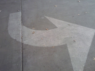
Initially, the idea of having to find twenty arrows for a journal was startling. But as said by some before, once you get going it becomes one of the easier things to do! Before you know it, you have too many arrows! I started my 'arrow campaign' just outside the front of Taylor Hall on North Campus. Almost immediately I noticed at least three! Three became six, six became ten...and so on! With a walk downtown(not even necessary to finding enough), I was easily finding more than my quota. Most arrows I found were between here(Taylor Hall) and route 66 downtown.


These first two arrow pictures, an iPod shuffle's 'play, forward and backward' arrows and the arrow of a compass indicating 'north' were the easiest to find, I didn't even have to leave my room! It's amazing if you think about it. For instance, on any standard 'music playing device', you have up to five arrows(similar to what Phil Patton pointed out in his article, Setting Sights at the Arrow), Thats crazy!!! And how would you have known unless you looked? Same as my compass, we've all seen the arrow to indicate north, but has anyone really given any thought to the meaning of the arrow? We seem to instinctively know it's meaning but none of us seem to really reflect on 'the arrow'. Interesting.

This Exit Sign Arrow, was a random shot I took leaving Taylor Hall on my way to lunch. Here again, direction is indicated through the simpleness of the arrow. It's meaning is instantly recognizable and obvious, allowing us the know how to find the 'exit'.

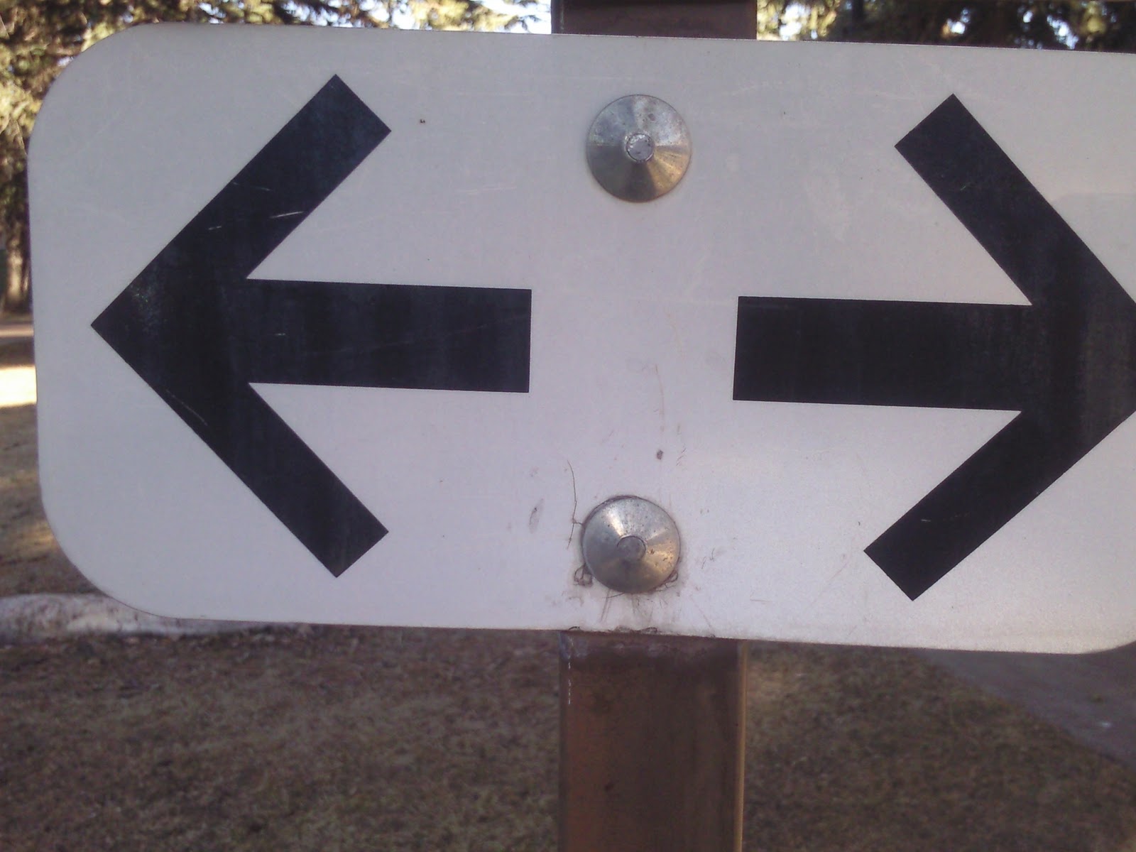


All five Images above were taken out front of Taylor hall. From 'one way' to 'parking' to 'time' all contain arrows in some form. A "one way" signifier by itself means literally nothing to the viewer without the proper "signified", the arrow. How would anyone know(in some cases) which was the "one way" if it was just the text? Putting arrows for parking saves the amount of material used for signs by spreading meaning through a single sign to multiple spaces. As for time, who isn't familiar with the hands of a time piece? Without those hands(arrows) you would not be able to gauge the time rendering any watch or clock useless.


The above five are all necessary for conveying specific instructions on where to find something, or how something is to be used. Meanings derived from these mechanisms are easy to comprehend and cannot be misconstrued. The arrows help reinforce, what might be considered obvious. I believe I found all of these between the Drury Inn at North Campus and the Flagstaff Christian Church before Downtown Flagstaff.


The above two are located at and in the Drury Inn and both are relating to mechanical doorways, an automated door and an elevator. Both arrows indicate what we acknowledge as 'up'. While immediately obvious at the entrance of an elevator to mean, "going up", the arrow above that one is unclear as to why an automatic door should have an 'up' arrow....?


The remaining five were all found north of campus, between Butler and downtown. All five, in each form they come were used to indicate position or direction on top of or under the concrete. Obviously this can be very important depending on circumstance. When we drive our cars around, it's important to know which way our lane is turning so that we do not end up in a collision. Arrows show you where to turn, where you are, where you will be, whats ahead, below, up, or anywhere. And as stated in the Article, they are everywhere. If you are looking you cannot miss them. The meaning of the arrow has been ingrained into our very culture(s). And has been around longer than any of us and will be around long after we're gone. The arrow is an amazing tool when you get down to it.
Subscribe to:
Comments (Atom)